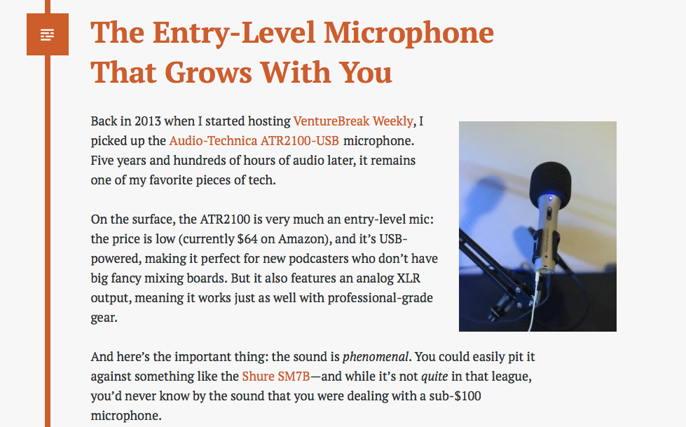
Left- and right-aligned images look beautiful on desktop browsers, but sometimes with responsive WordPress themesA WordPress theme is a set of files that determine the design and layout of a website. It controls everything ... More you end up with something like this:

Yuck.
Because of the skinny portrait-style image, the text is wrapping improperly on mobile, and it looks like a mess.
Very frustrating, but with a couple of lines of CSS, we can clear this right up.
The approach I’ve found most effective is to automatically center your left- and right-aligned images on smaller screens.
To do this, open up the stylesheet for your child theme, or the Custom CSS section of the theme Customizer, and drop in the following code:
@media only screen and (max-width: 600px) {
	figure.alignleft, img.alignleft, figure.alignright, img.alignright {
	float:none;
	display:block;
	margin-left:auto;
	margin-right:auto;
    }
}
The logic here is simple: on screens with a width less than 600 pixels, images aligned to the right or left (via WordPress’s default style classes) will be centered via float:none, margin-left:auto, and margin-right:auto. (Feel free to modify the max width to suit your needs.)
The result? The image in the example above now appears centered on smartphones, but still perfectly right-aligned on larger screens:


Much better!
I hope this helps! If you have any questions, please feel free to leave them in the commentsComments are a feature of WordPress that allow users to engage in discussions about the content of a website. ... More below.


